
Affinity Diagram: A Practical Guide
/The Affinity Diagram is interesting to use and is one of my favourite sense-making tools. It allows you to sort out masses of information into natural groups based on the common characteristics they share or the categories they fall into. It’s also an interactive tool for analyzing the ideas/suggestions you get from brainstorming sessions. It is also known as the KJ Method, after its founder Kawakita Jiro, a Japanese Anthropologist.
PRACTICAL APPLICATION
- Describe the problem or issue
- Brainstorm - Tell each participant to record each idea they have on separate post-it notes
- After the participants are done, tell them to paste their post-it notes on a flip chart one at a time in any particular order
- Discuss with the participants to identify similar ideas and group the similar ideas together as individual categories - You'll need to identify the connections between these ideas.
- For ideas that do not fit anywhere, separate them as stand-alone post-it notes
- For ideas that fit into more than one category, create duplicate post-it note(s) and place each under the appropriate category.
An example is shown below:
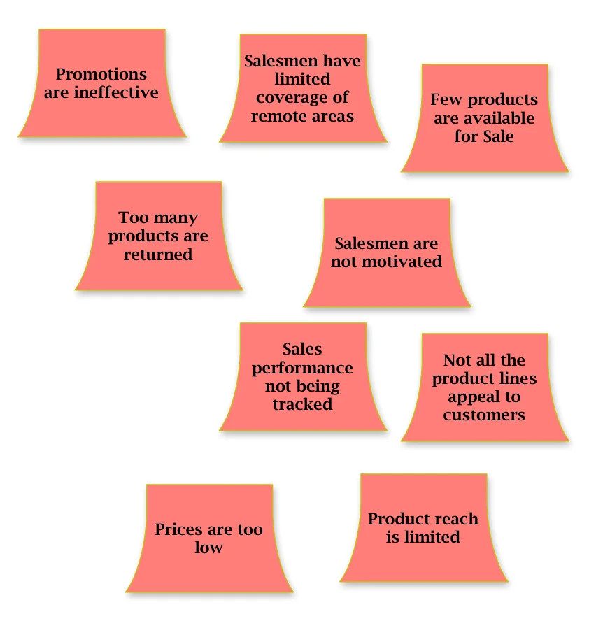
Problem Description: Why are we not making enough sales?
1. After brainstorming, the participants may place their ideas (written on post-it notes) on the flip chart as follows:
, After this, sort them into similar (vertical) groups as follows:
3. On grouping them, identify a suitable header for each group as follows:
With this Affinity Diagram, analysis becomes easier to accomplish. By applying the Affinity Diagram technique, the business areas to be investigated have been revealed: Product, Sales and Marketing. If there were more post-it notes/issues linked to the Marketing Category, it would imply that marketing presents more impediments to increased sales and the BA could decide to focus on that area first.
What has been your experience with this technique?


User story maps are an interesting and collaborative way of eliciting user requirements. One of the reasons why I find it so powerful is because it provides a unique approach for aligning discussions relating to the user, their goals, the process that supports the accomplishment of their predefined goals; and the requirements that need to be addressed to solve business problems.